
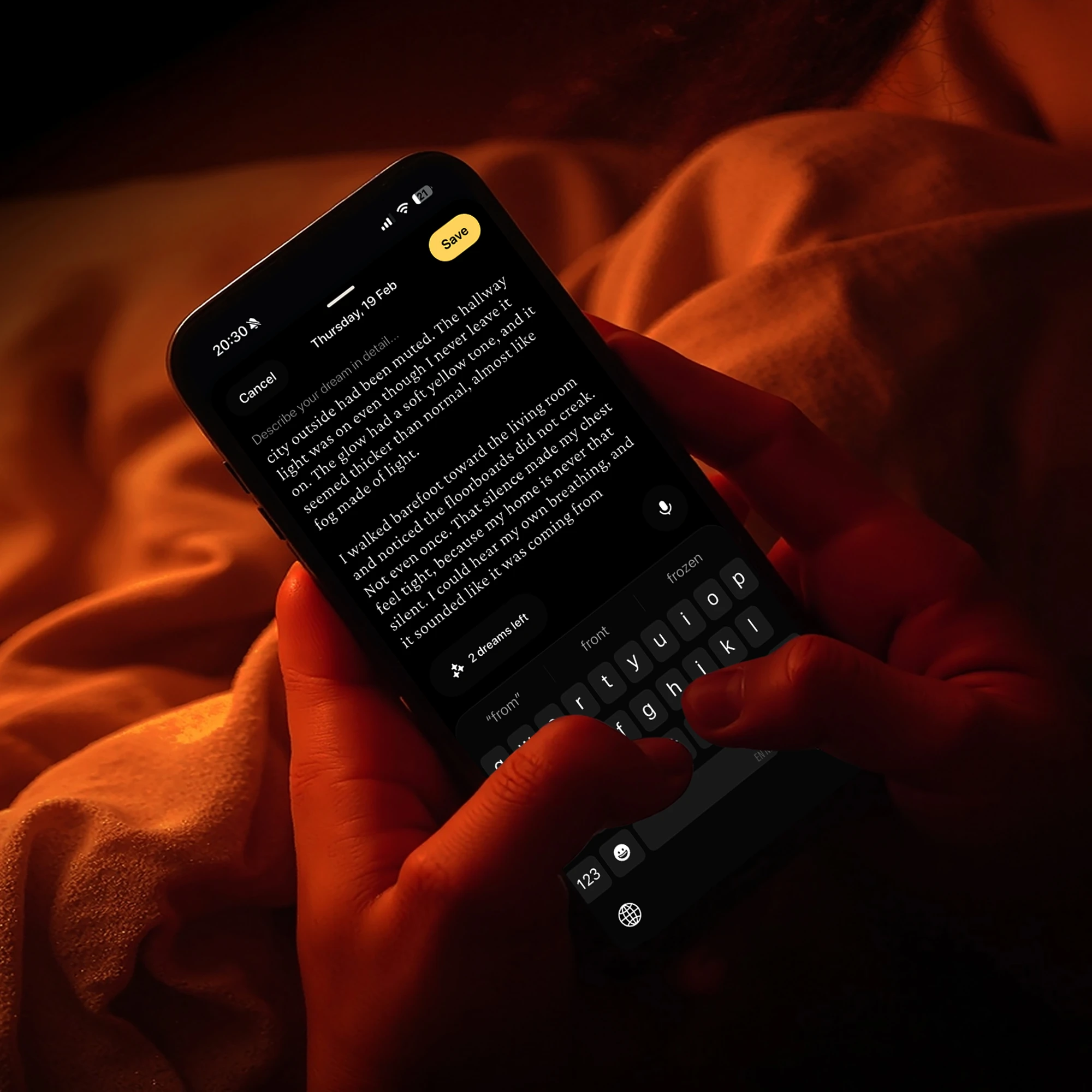
Dreamlab
AI-powered dream journal, from zero to launch.
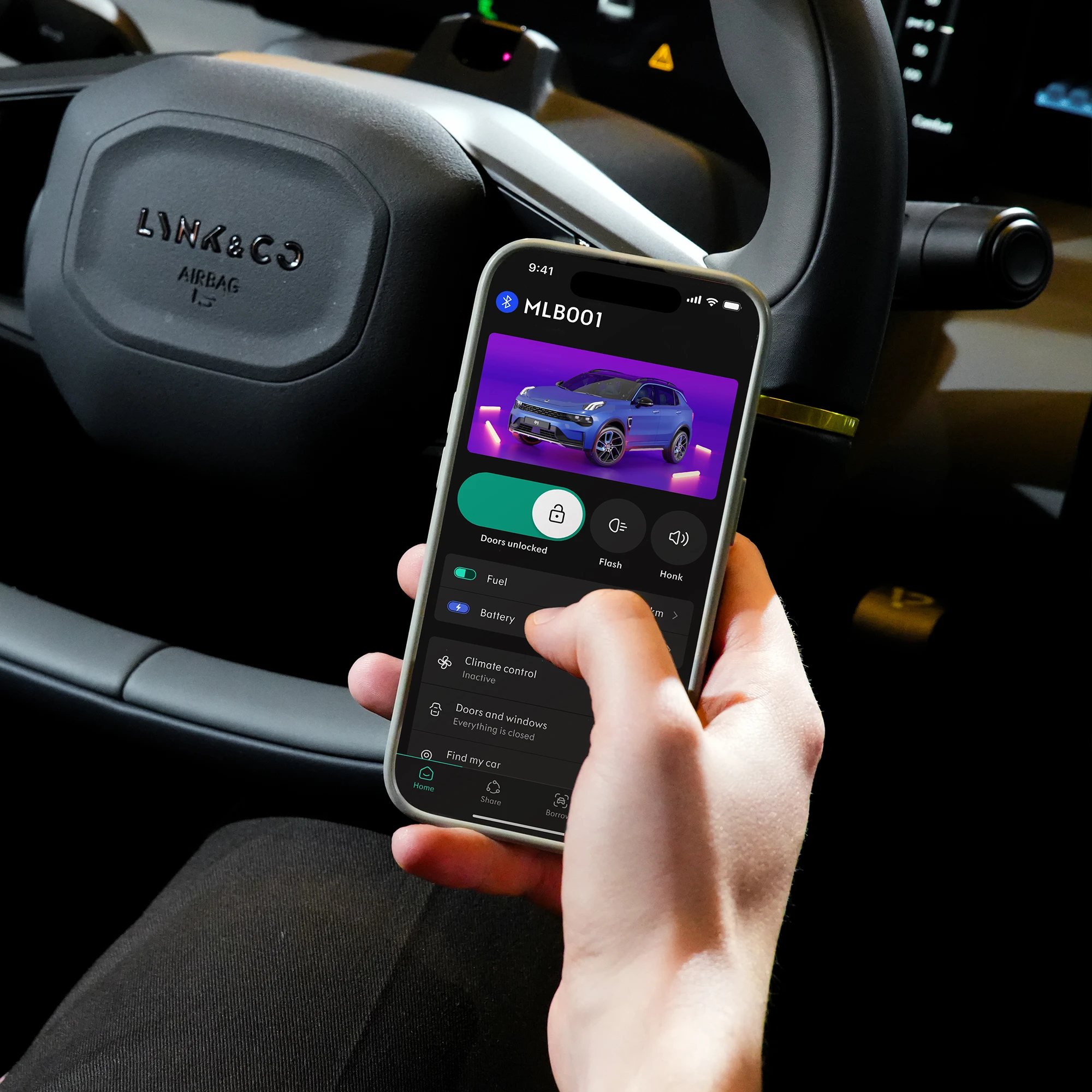
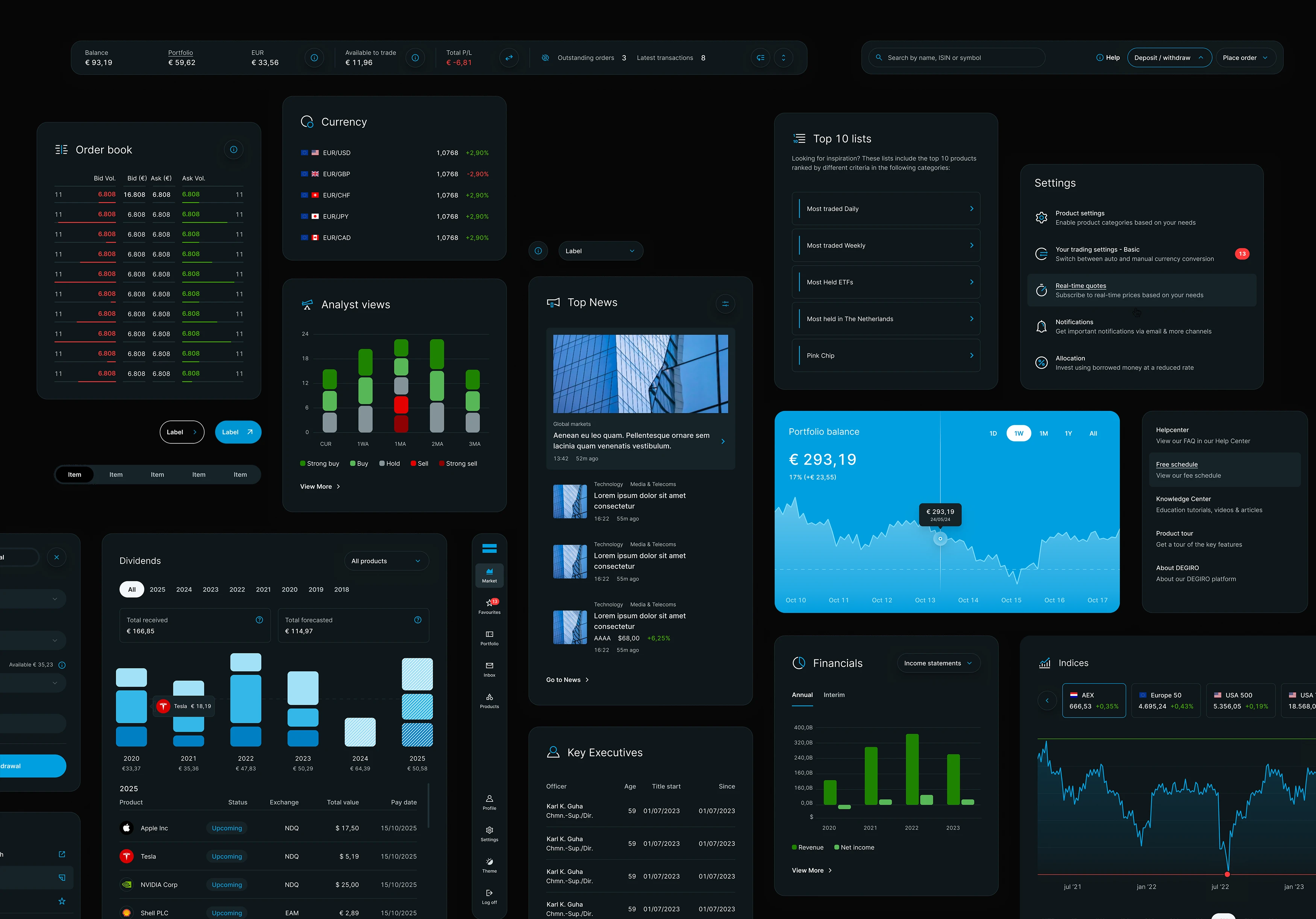
DEGIRO
A full art direction overhaul, design system, and custom UX sounds for Europe's leading online broker.
Brief
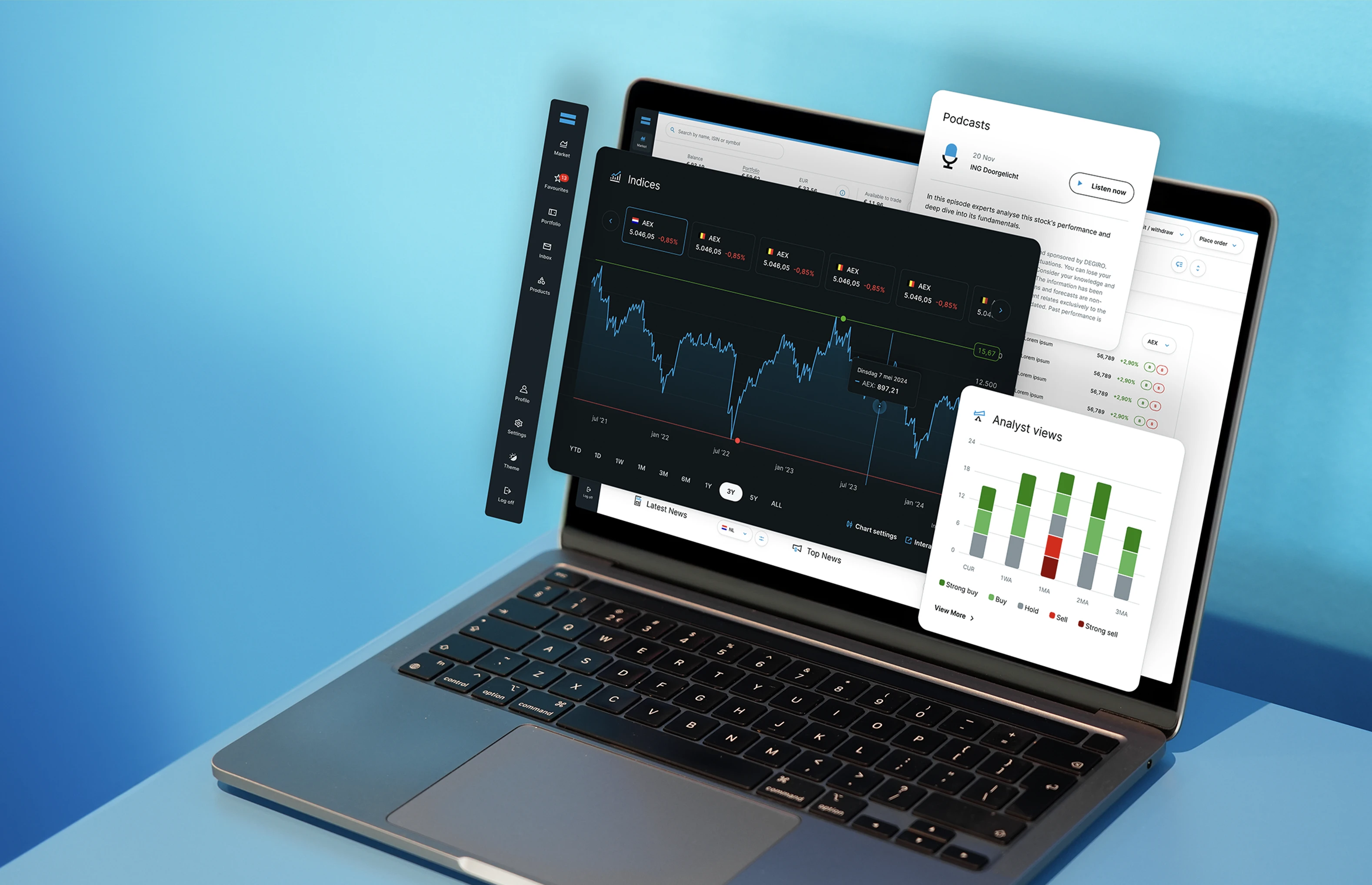
DEGIRO had built a loyal base of over 10 million investors across Europe by keeping fees low and access simple. But the platform itself had not kept pace. The interface felt dated, the visual language was inconsistent, and new features were being bolted on without a coherent system beneath them. The ask was to modernize everything: art direction, components, sound, and accessibility, without making existing users feel lost.
001
Investors across Europe relying on the platform daily
002
Revenue growth in 2025, reaching €560 million
003
Mature new features launched including crypto.
004
New components designed during the platform revamp.
What we Solved
What started as a three-month art direction engagement grew into a year-long creative partnership. New visual foundations, a token-driven design system, feature design, and a first-of-its-kind sound layer. All without disrupting the experience for the users who were already there.
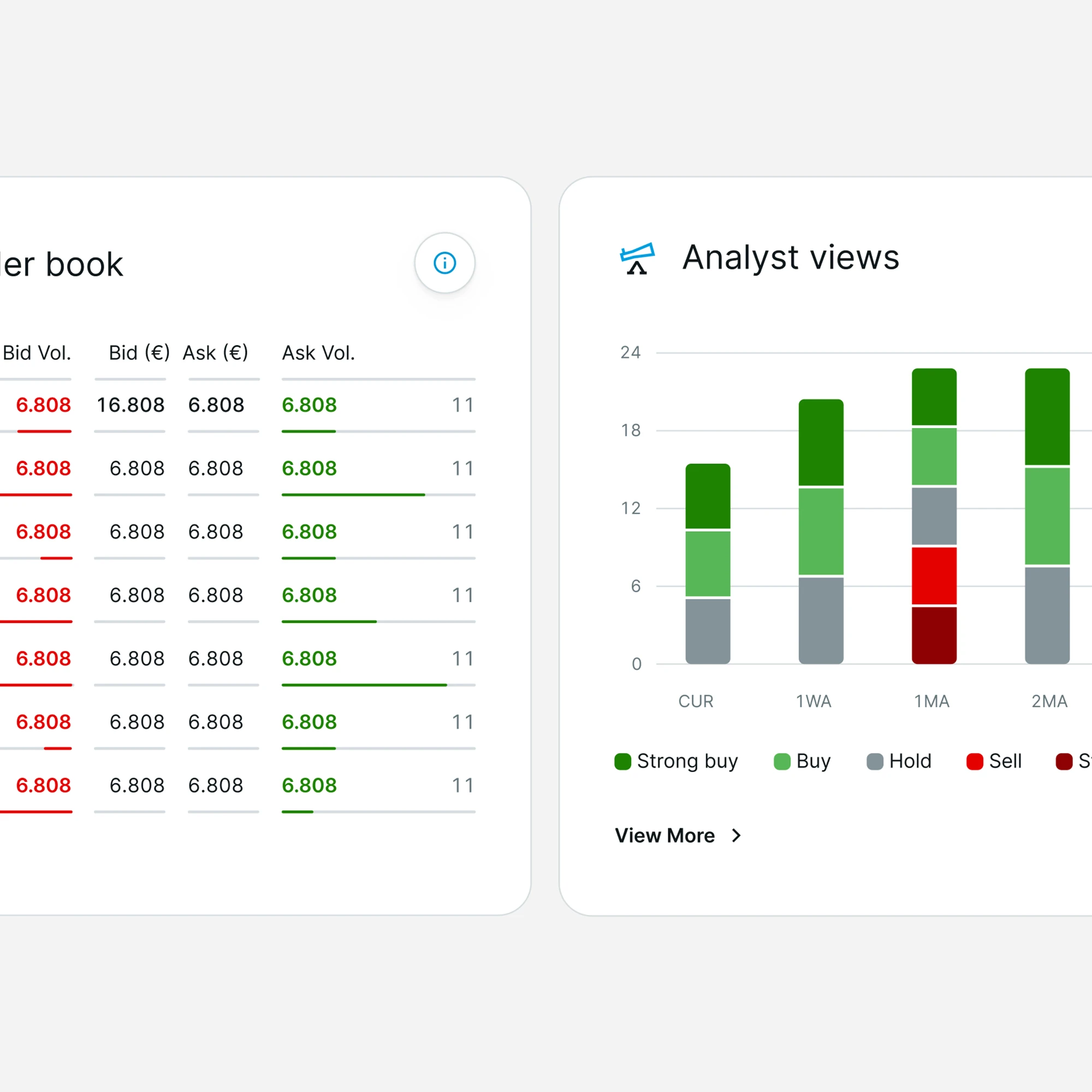
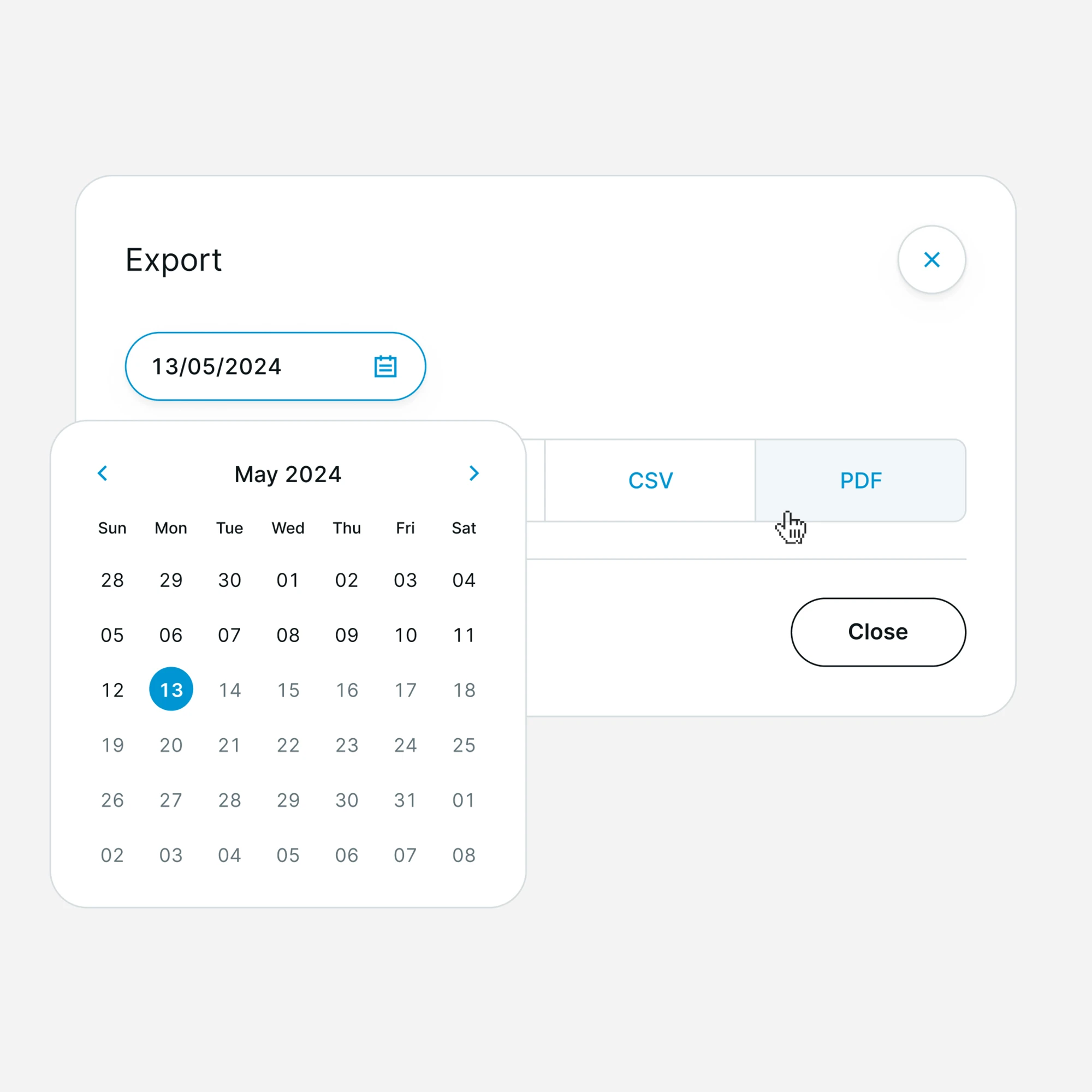
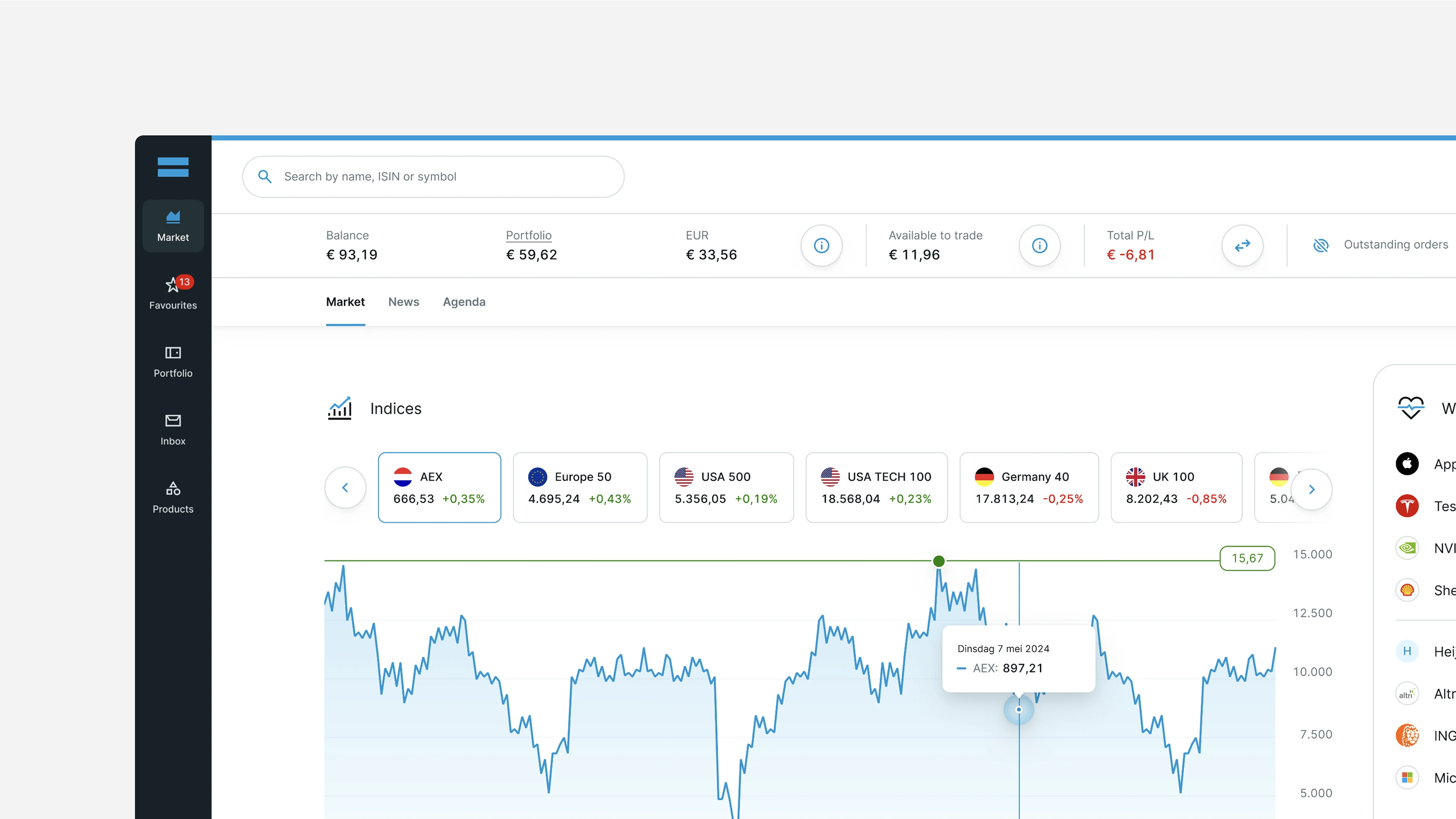
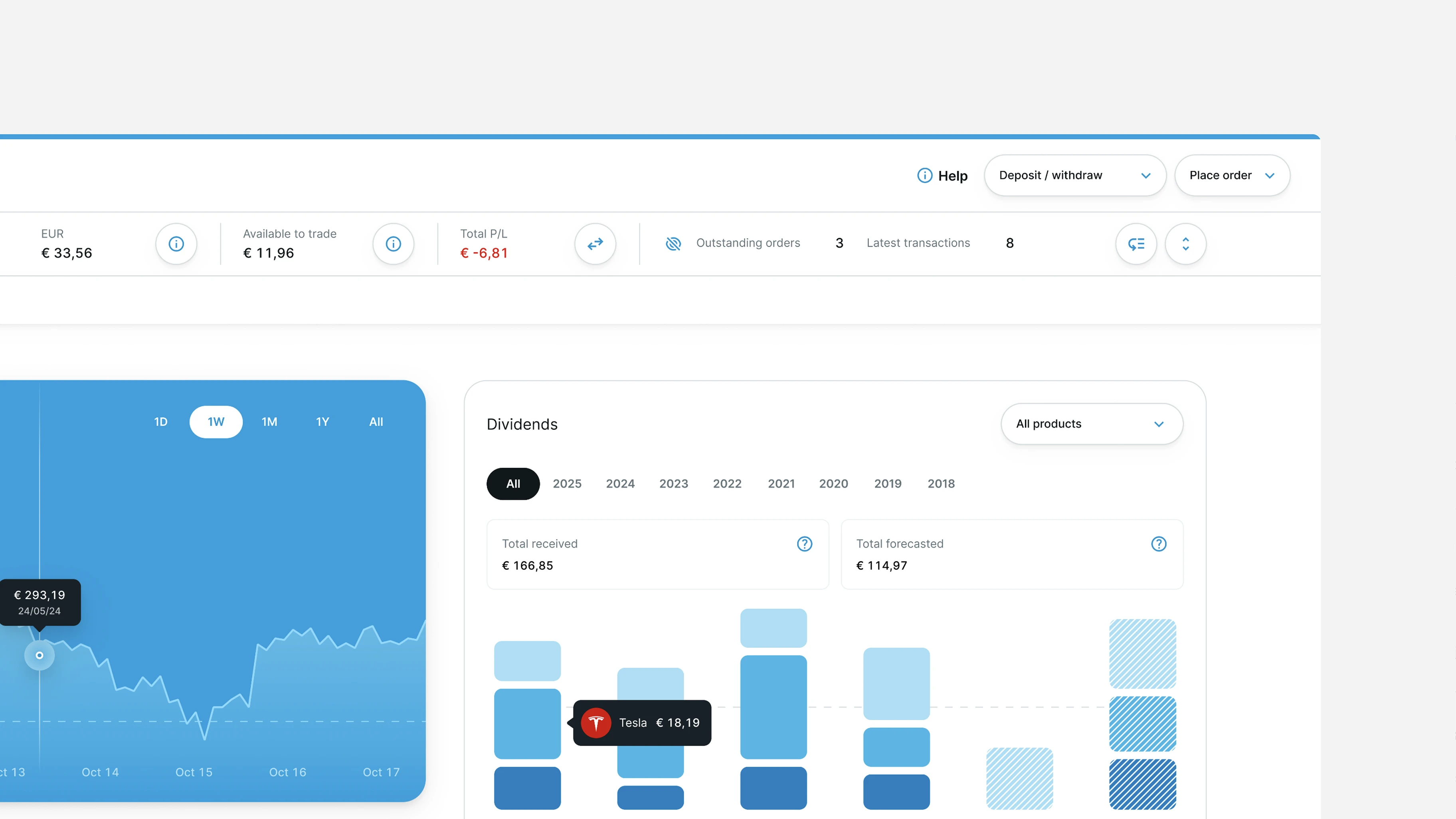
Clarity, consistency, and speed. Every visual decision was made to reduce cognitive load and support fast, confident decision-making. A new type scale, a refined color system, and tighter layout logic gave the platform a coherent visual language for the first time.
A full component library was designed to cover the platform's seven core templates. Every component adapts across layouts, color modes, and device types without needing to be rebuilt. A token system covering color, typography, spacing, and motion gave designers and developers a shared source of truth. The result is a system that absorbs new features without accumulating visual debt.
Early in the process, the buy and sell buttons were redesigned from red and green to blue and black to improve visual consistency. Real DEGIRO customers pushed back hard. For active traders, those colors are not aesthetic choices. They are functional signals built from years of muscle memory. Red and green were reinstated. The rest of the updated identity was preserved around them. The best design decision is not always the most obvious one.
Sound Design
Before this project, DEGIRO relied entirely on visual feedback. When you place a trade or it executes, you see it, but you might not notice it if your attention is elsewhere. Two branded UX sounds were designed: one for trade placement, one for trade execution. They work independently and also in sequence for back-to-back moments. The sounds are digital in character but layered with soft piano to feel human rather than mechanical, distinct enough to be recognizable, understated enough not to intrude.
Explore more work